Poster Triptych
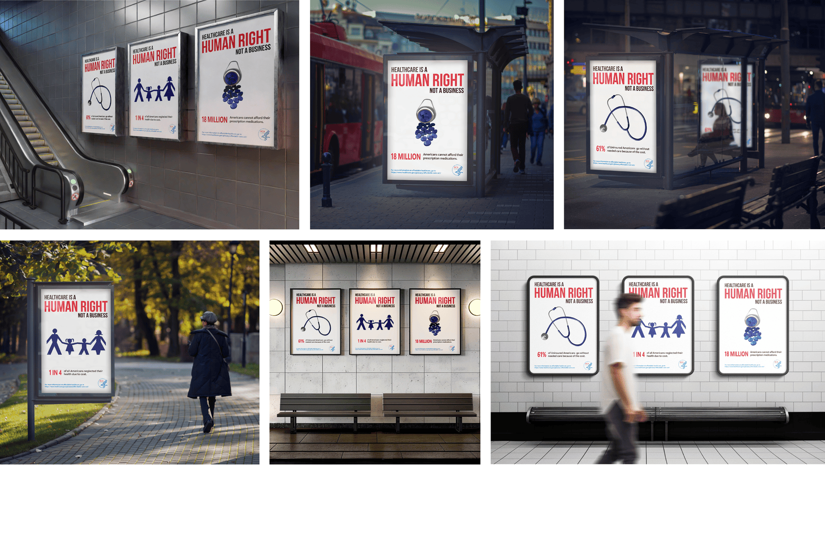
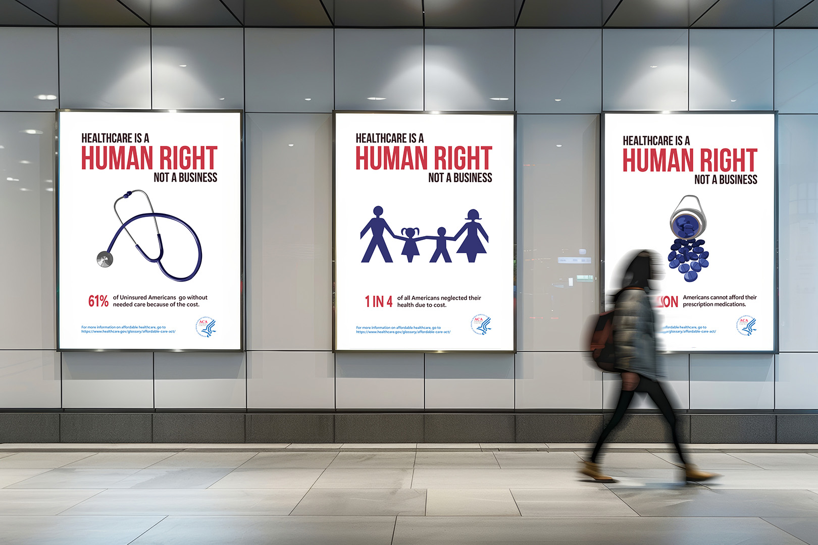
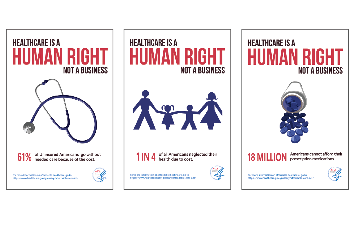
My poster triptych focuses on the lack of affordable healthcare in the United States. These informational posters show facts on how a lot of people in the United States go untreated, go without their required prescriptions, whether they have insurance or are uninsured, making healthcare more of a business than a human right. Hence the tagline, “Healthcare is a human right, not a business.”
Sketches
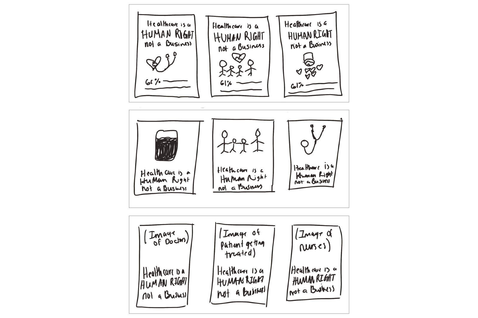
These are my thumbnail sketches. The first is more about what I went with, which is the pills, a stethoscope, and the family. The second sketch has a blood bag, a family, and a stethoscope. Then, for the third sketch, the idea was to use acutal images of doctors, nurses, and patients with just the tagline and no facts.
Color Palette
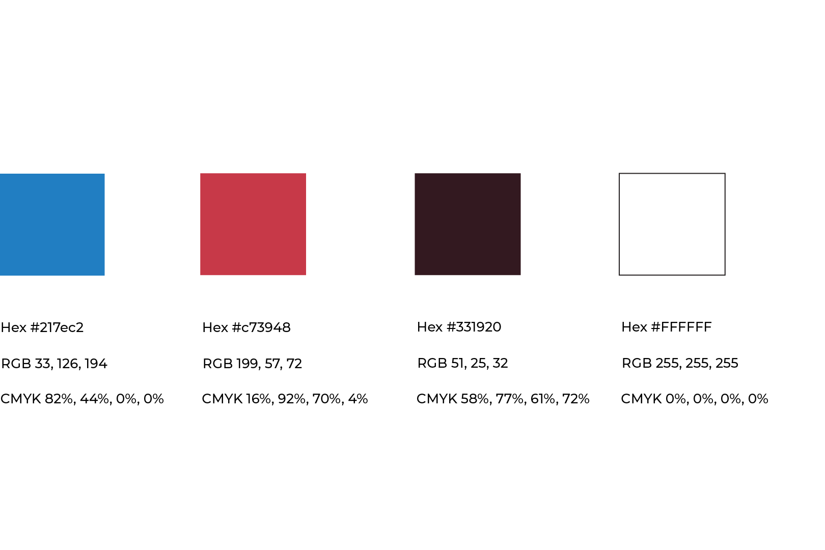
I chose this red because it is bright and will impact the viewer visually. This red, paired with the typography, makes the tagline an even stronger message. The blue color was chosen based on the sponsor, the Affordable Care Act logo. This shade of blue also goes well with the illustrations since it is a darker navy color. Both red and blue are commonly associated with healthcare, which makes them the best color options for this project.
Typography
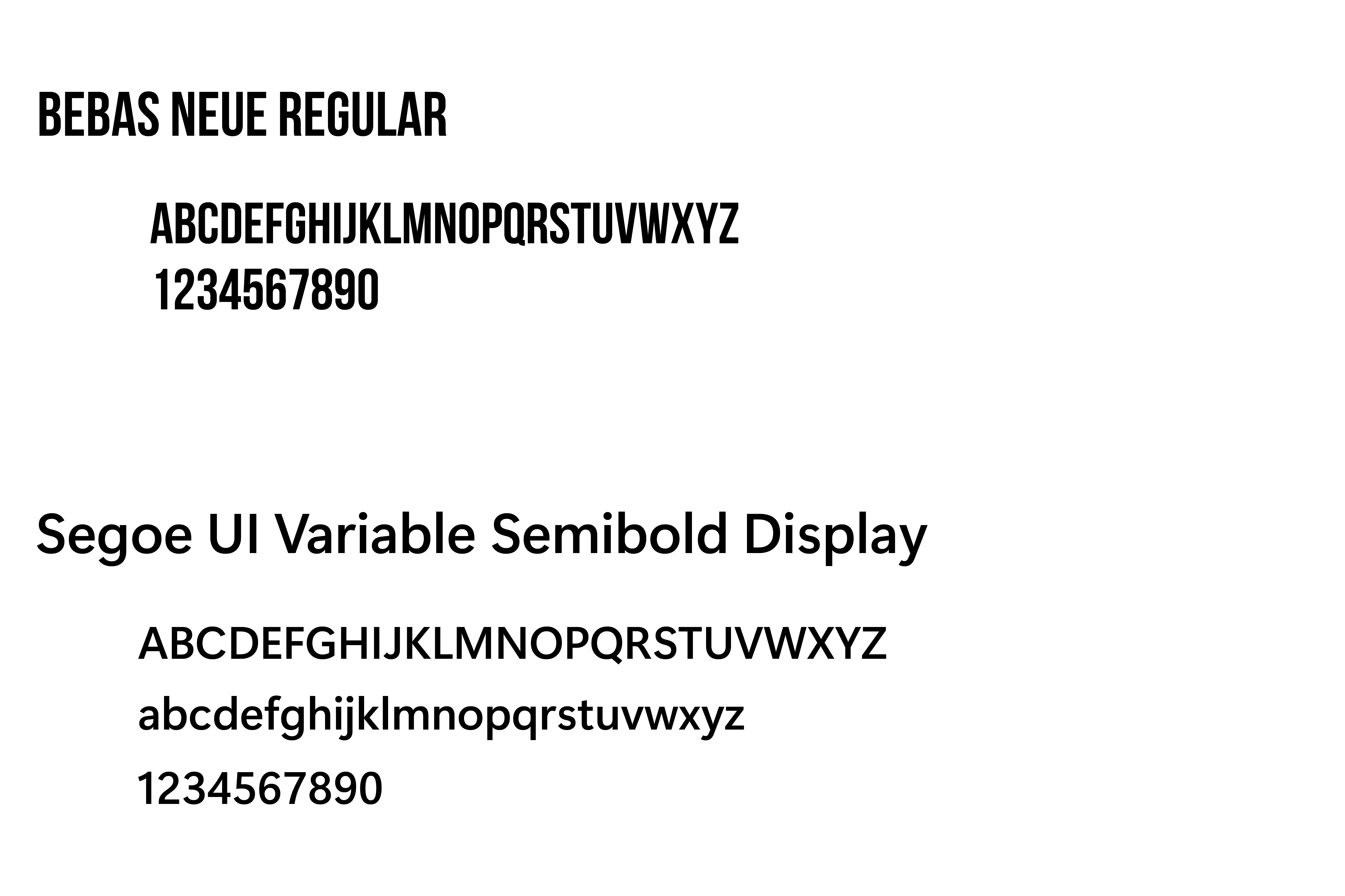
I wanted the typography for the posters’ titles to be bold and blocky to make a statement, and I achieved that by using Bebas Neue Bold. As said previously, this, paired with the red, impacts this project visually. Then, I used Segoe UI for the sub-text because this typeface has lowercase letters, unlike Bebas Neue. The lowercase letters are needed for the facts and the link to where to get more information. This allows for a hierarchy between the different typefaces.
First Draft
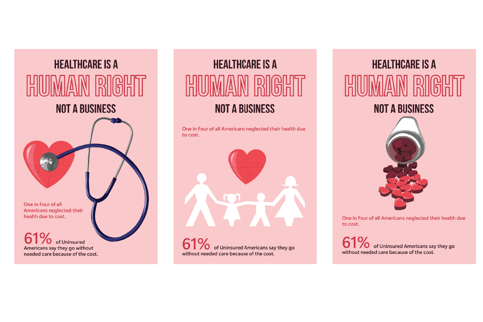
To start, I picked out the same red with a light pink background and heart-shaped pills and had hearts on each poster. This was not an effective design because the hearts made these posters seem to be for something heart-related only, not healthcare overall. Those paired with the light pink background made it feel Valentine's Day-themed.
Second Draft
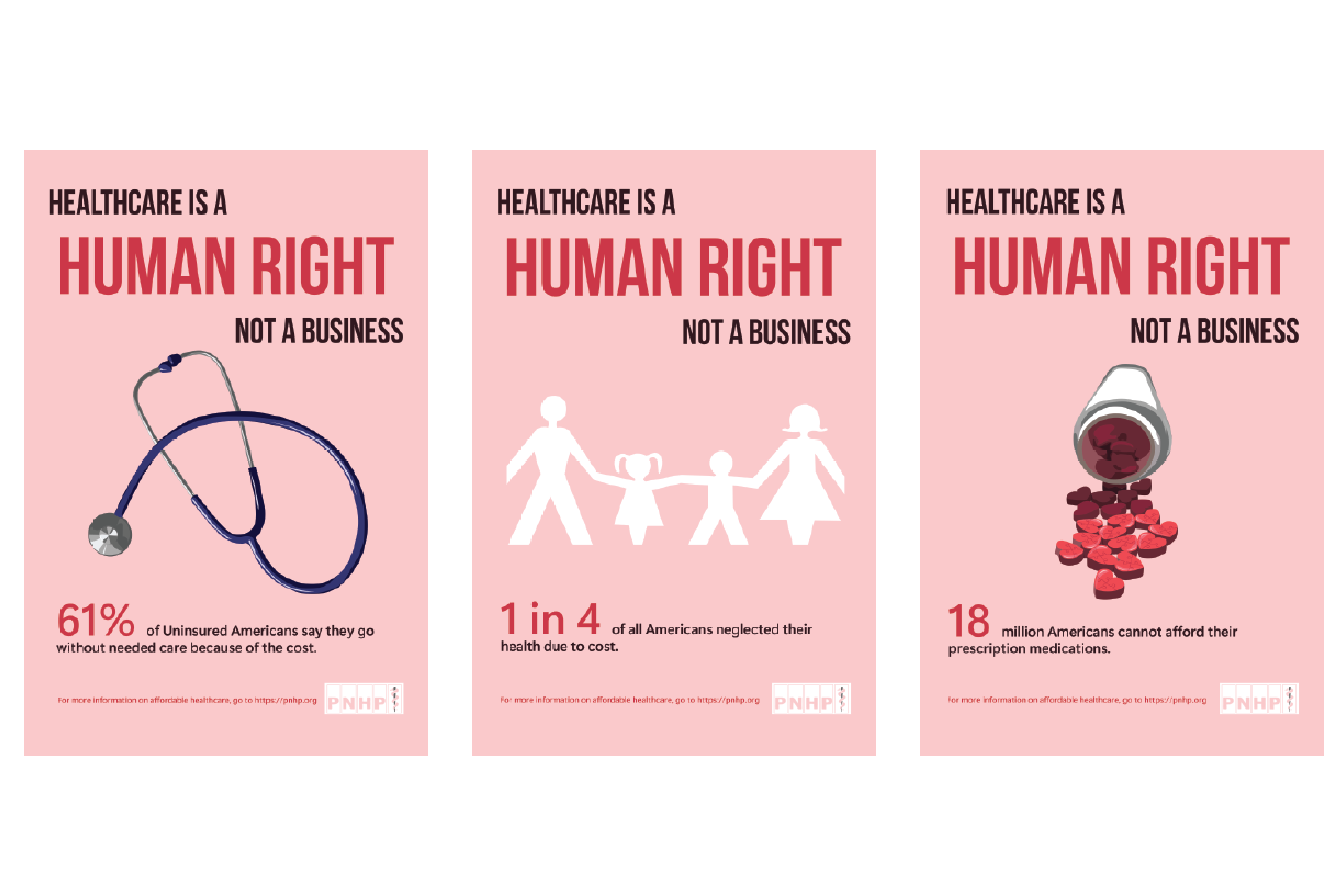
For my second draft, I changed the typography up top for “Human Right” to have a fill, and then “Healthcare” is left aligned, and “Not a Business” is right aligned. This allowed the already strong tagline to make a more significant impact on the viewer. With the hearts removed, the Valentine's theme is not as prominent. However, the pink background still did not work; the contrast between the typography and the background could have been better with a different background color, and it felt too joyful for this topic.
Third Draft
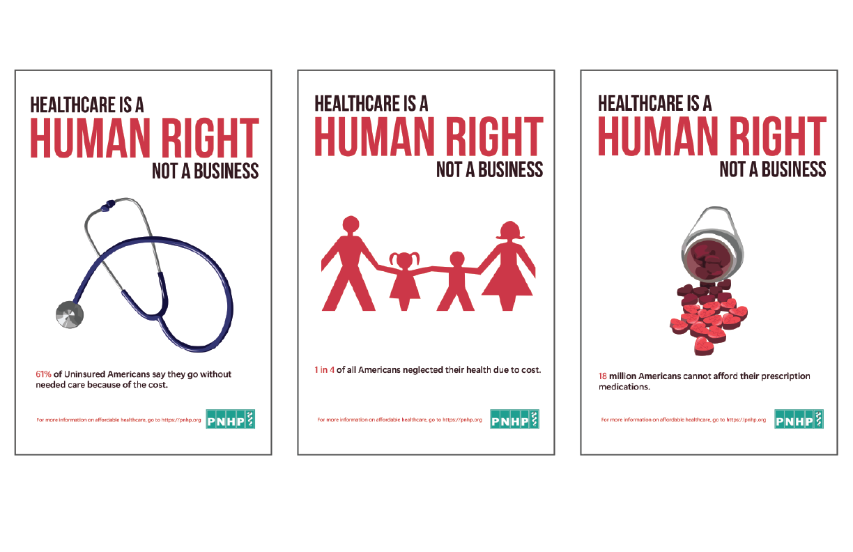
I changed the background to white for my third draft to make the text stand out even more and help contrast the typography and the background. I also changed the stats in the subtext to the same size as the rest of the text, but this made it feel like the stats were just thrown on the poster without real thought. As for the illustrations, they were inconsistent. The first illustration is navy, and the others are red. At this point, the other posters with the red illustrations had too much red in the poster, and no other color broke it up.
Final
Finally, I changed the heart-shaped pills to regular-shaped pills to remove the unnecessary meaning that the hearts had added. Then, I changed all the graphics to dark blue to break up the red and create consistency between all three posters. I changed the stats in the subtext to align with the two lines of text so that they stood out and were strong by themselves. The sponsor text at the bottom was changed to the same blue as their logo to create consistency with the Affordable Care Act brand.
Environmental Contact
