Concert Posters
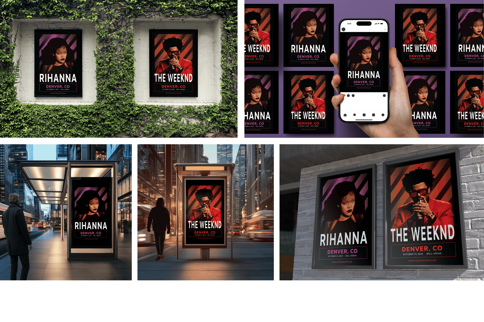
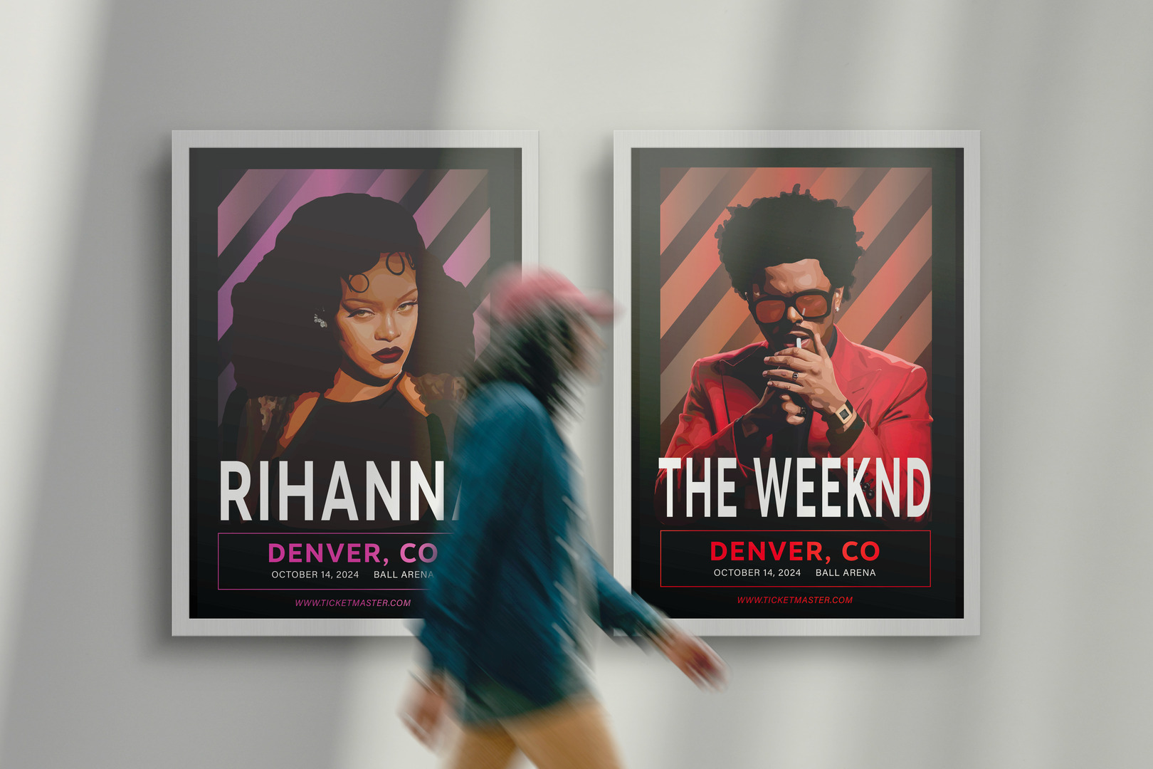
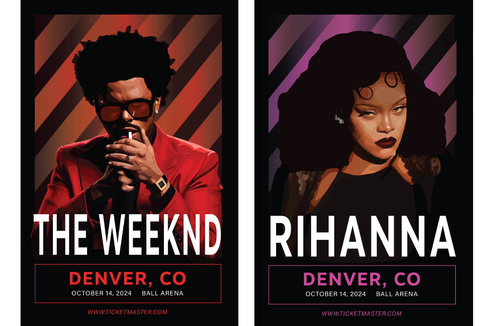
For this project, I chose two musicians, Rihanna and The Weeknd, drew their portraits, and then created concert posters. The portraits were created initially for a different project, but after some thought, concert posters seemed to be a better implementation. These two people are known for being bold in their music and outfits, which carries into the album covers and posters created for them. I wanted to continue the bold theme in my own design, and I achieved that through color, typography, and portraits.
Sketches
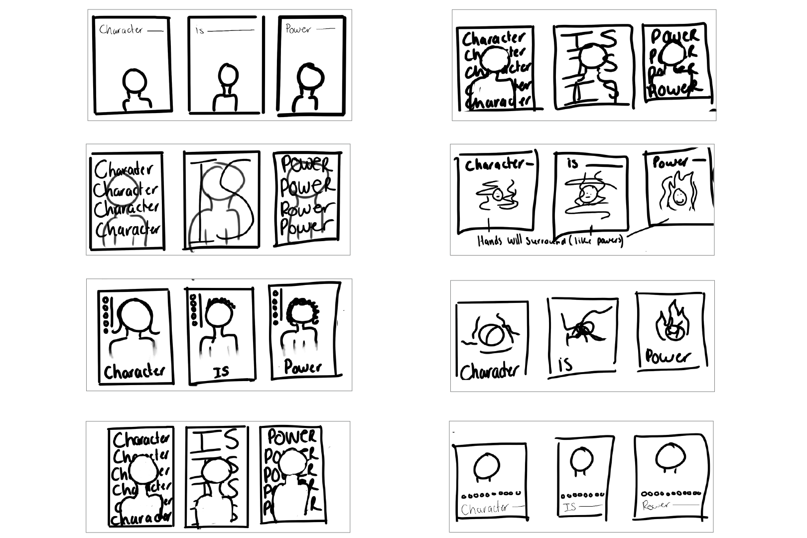
I started with eight thumbnail sketches. These were to accompany my original plan for the portraits, which used the quote “Character Is Power.” In these sketches, I tried different layouts for where and how big I wanted the type to be.
Color Palette
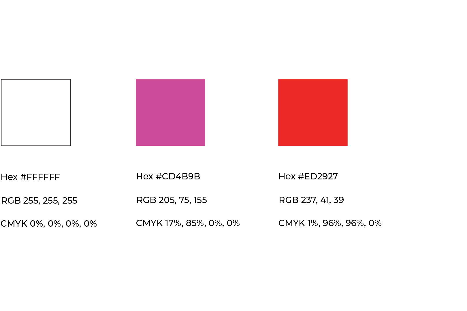
For the poster, I wanted the background to be bold and to really stand out as I feel that aligns with what people know these artists to be, which is bold. I went with a black background for both and bright colors for the gradients to pop when put over the black. I chose red and orange for The Weeknd poster to match his sunglasses and suit in the portrait. This allowed the portrait of him and the poster to tie together. Then, for Rihanna, her outfit didn’t have a pop of color, so after some research into her different stage performances and outfits that she has worn, I chose purple and pink, which works well with her portrait.
Typography
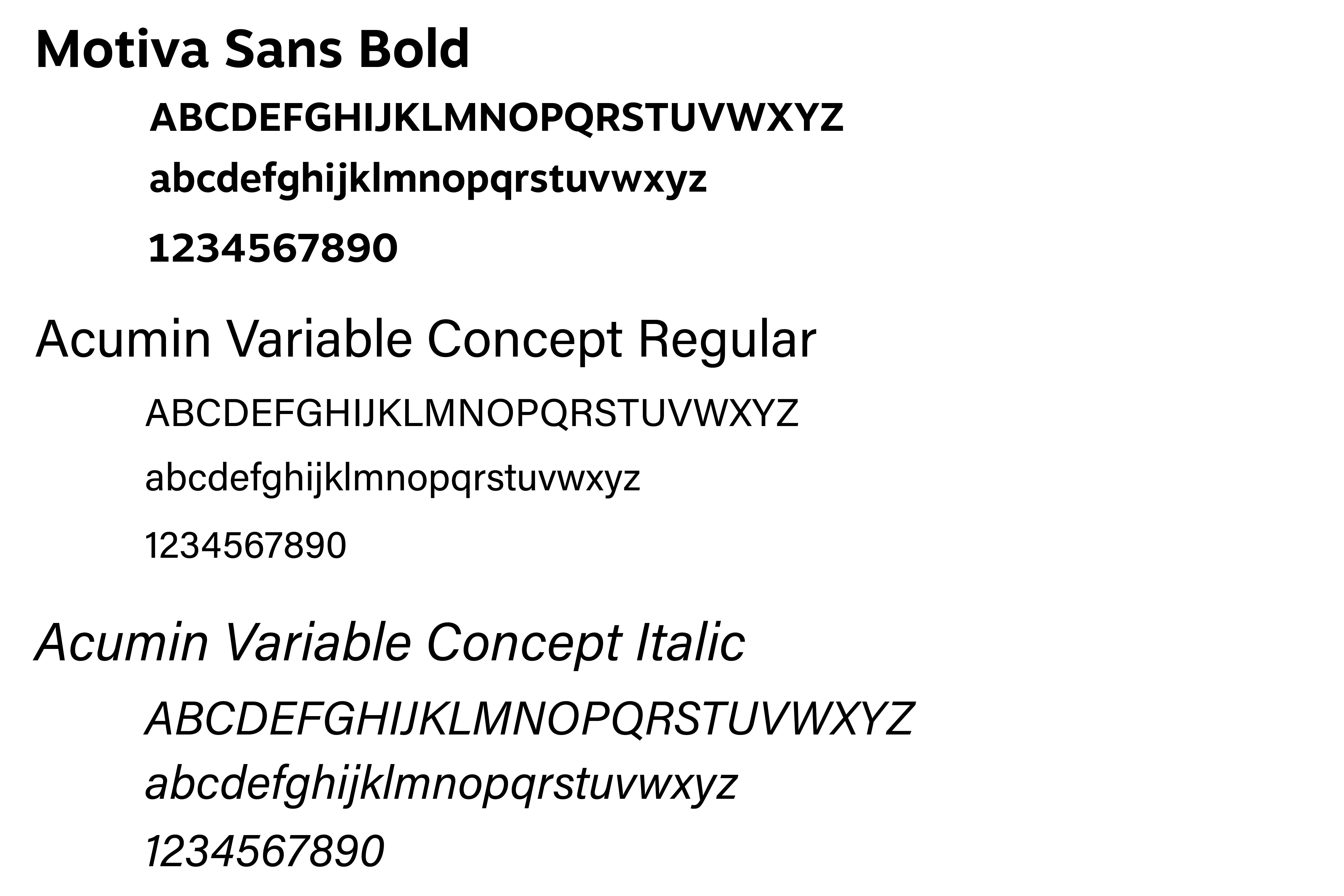
To go with the bold theme of these posters, I wanted their names and locations to be large and bold to really stand out. To do so, I went with Motiva Sans Bold. This typeface is easily readable and fits the overall theme and look of the posters well. Then, I used Acumin Variable Concept regular and italic to show hierarchy within the information on the posters. This was also a great option because these two sans-serifs pair well together as the bowls and apex are similar, but Acumin is lighter.
Illustrations
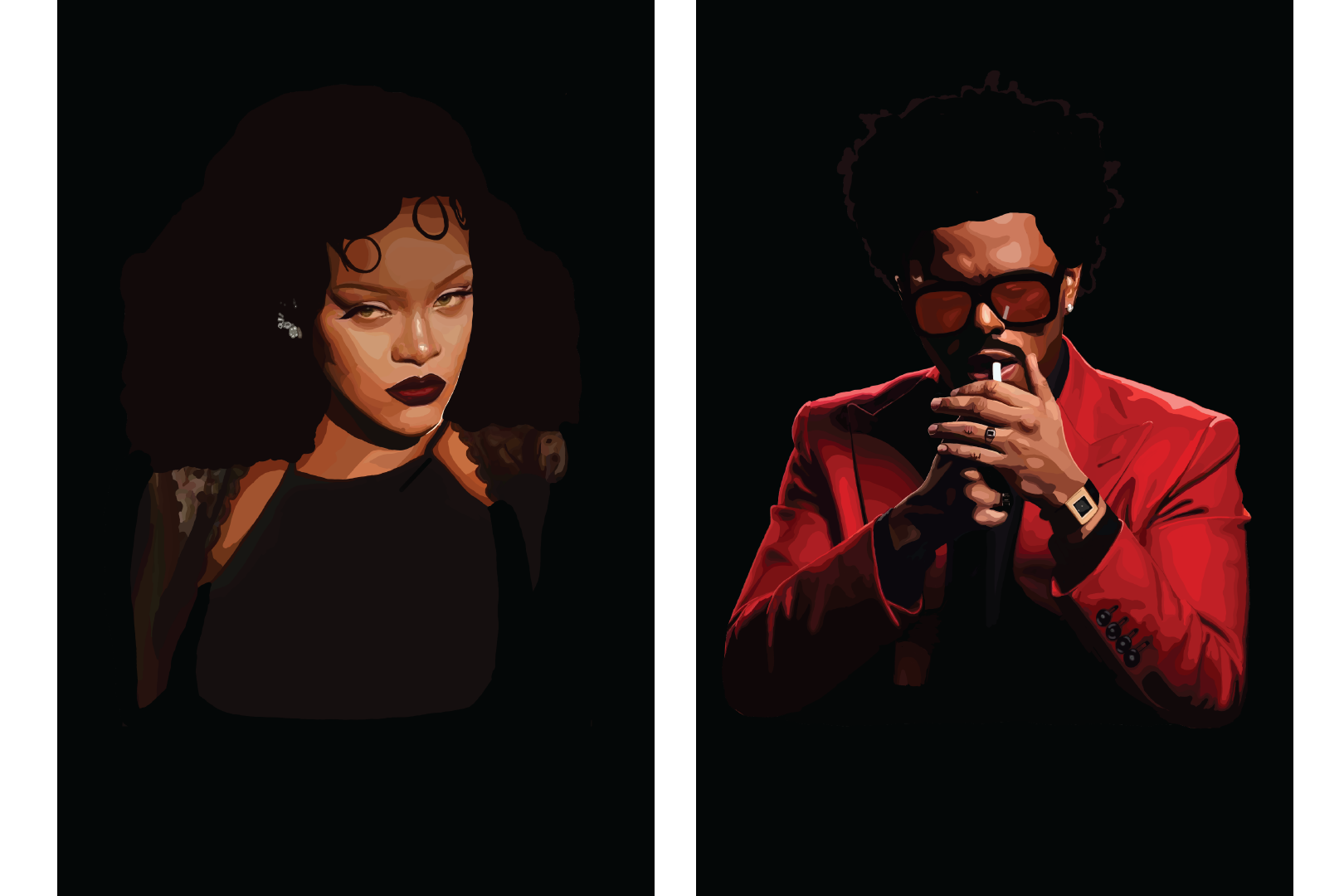
First, I drew Rihanna and The Weeknd’s portraits in ProCreate by using a reference photo. For both artists, I searched through their previous album release photography to find the image I wanted to use.
First Draft
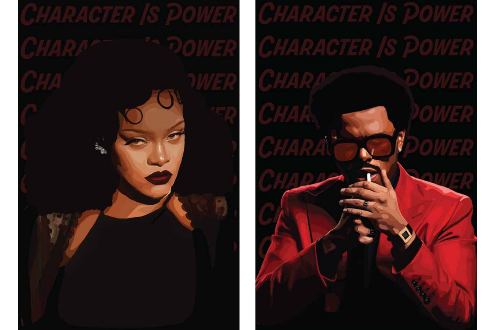
I created my first poster draft in Illustrator after drawing the portraits. For the first draft, I was still going with my original idea: to use the quote, “Character is power.” The problem with this was that the quote “Character Is Power” was not readable, and the overall design lacked any real visual appeal. There was no understanding as to why that specific quote was behind these artists.
Second Draft
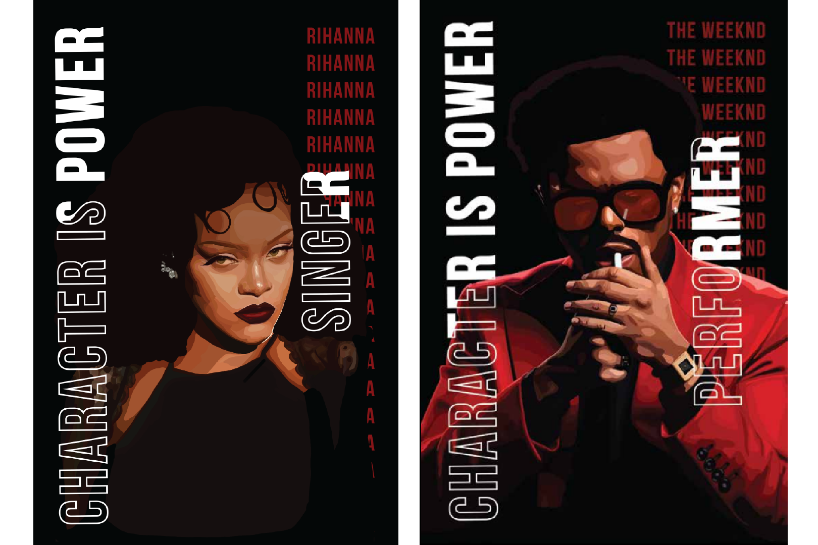
I changed where I placed the typography and added the person's name and what they do to try to make the quote more sense. I also did this to create a visual appeal and some sort of hierarchy in the typography. The new information did not help. After feedback, it was brought to my attention that people who do not know who these people are wouldn’t understand how they use their ‘character’ as their power. So, this is when I decided to go in a different direction and started on concert posters instead.
Finals
I removed all the typography and started over. I added a striped gradient pattern for a pop of color, which helped add to the bold theme I was going for when over the black background. The black background also created a frame around the striped gradient pattern and portraits. This created a very visible margin around the entire poster, which made it look more clean and put together. Then, I added a thin-lined box around the city, date, and location to better separate the information and add more of the accent color to the poster to better balance the color. The colors, typography, and images I referenced for the portraits created a bold design representing these artists' boldness.
Environmental Contact
