Book Design
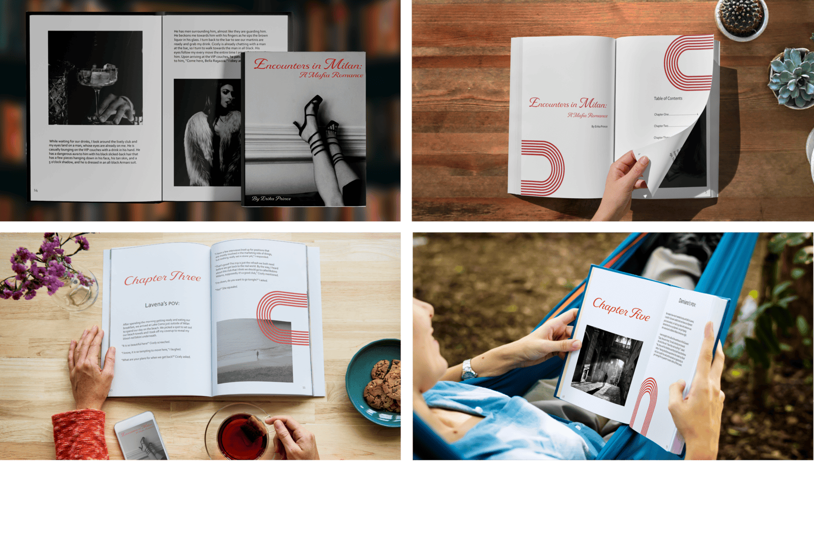
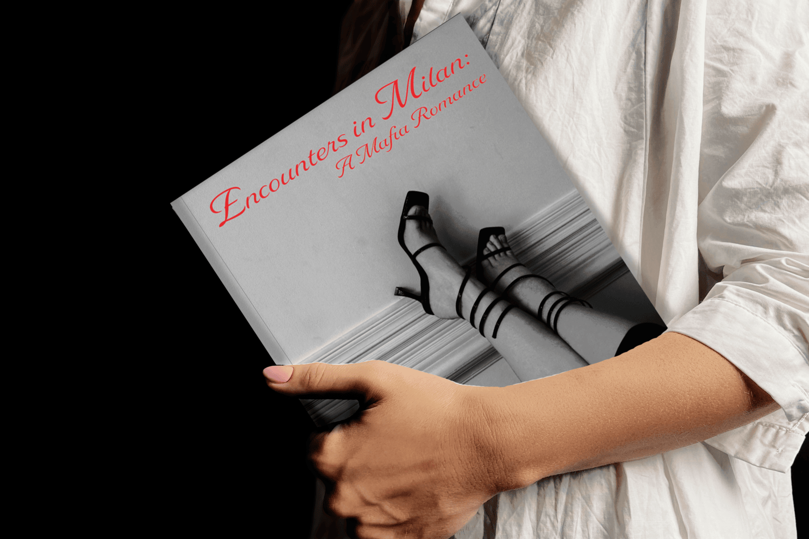
I wrote and designed a 12-spread book based on a mood board and images that I picked out first. This is a dark mafia romance book about a girl and her best friend who travel to Italy, where the girl meets the Italian Mafia boss. There is an instant connection, and they fall in love. The layout uses black-and-white images, bold line-arch graphics, and decorative typography to show the elegance of Italy.
Moodboard
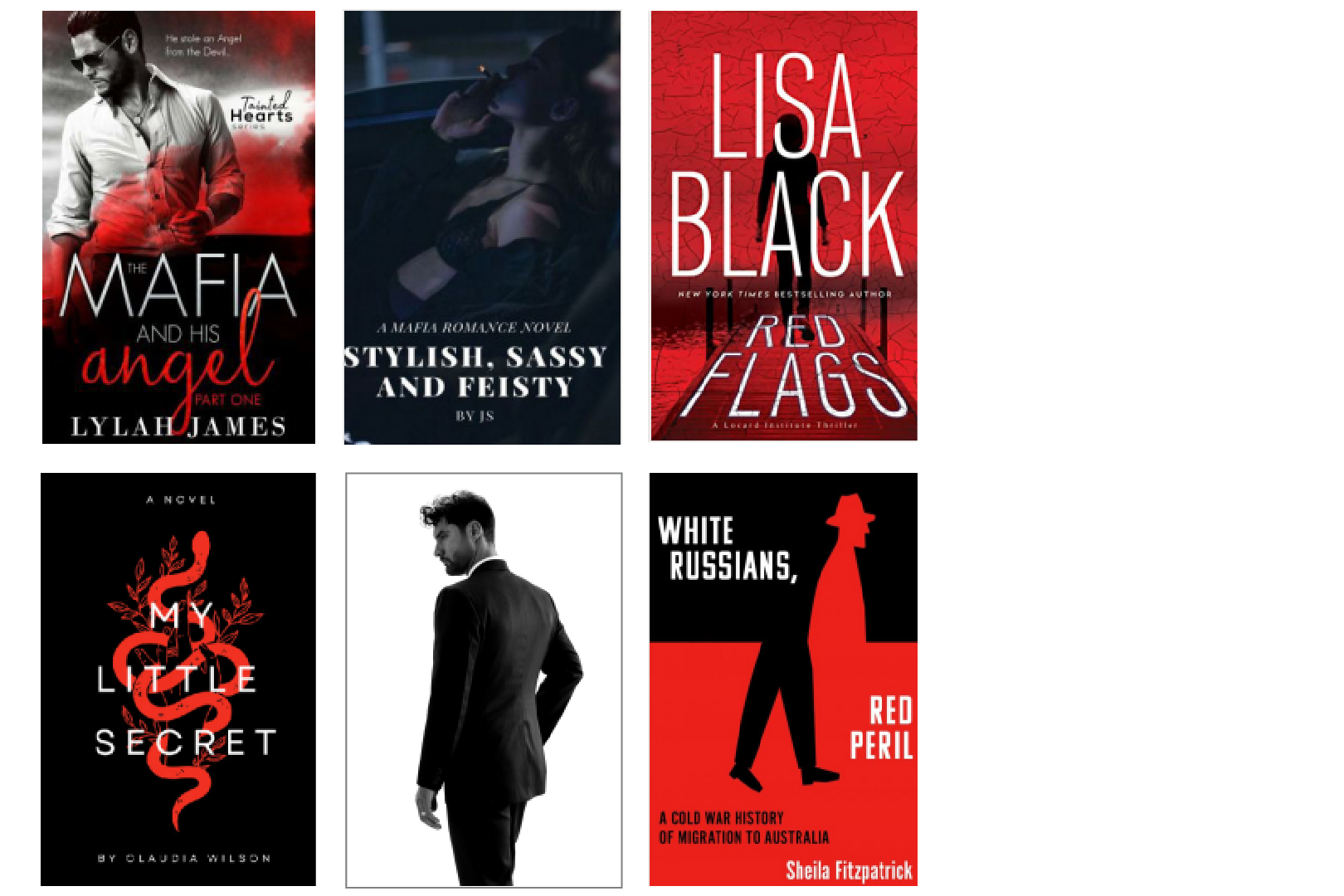
This mood board shows most books utilizing bright red, black, and white as the main colors, script typefaces, and sans-serif typefaces in mafia-related books. I used this mood board as inspiration in designing my book cover and layout. I also need inspiration in choosing my typefaces and colors.
Color Palette
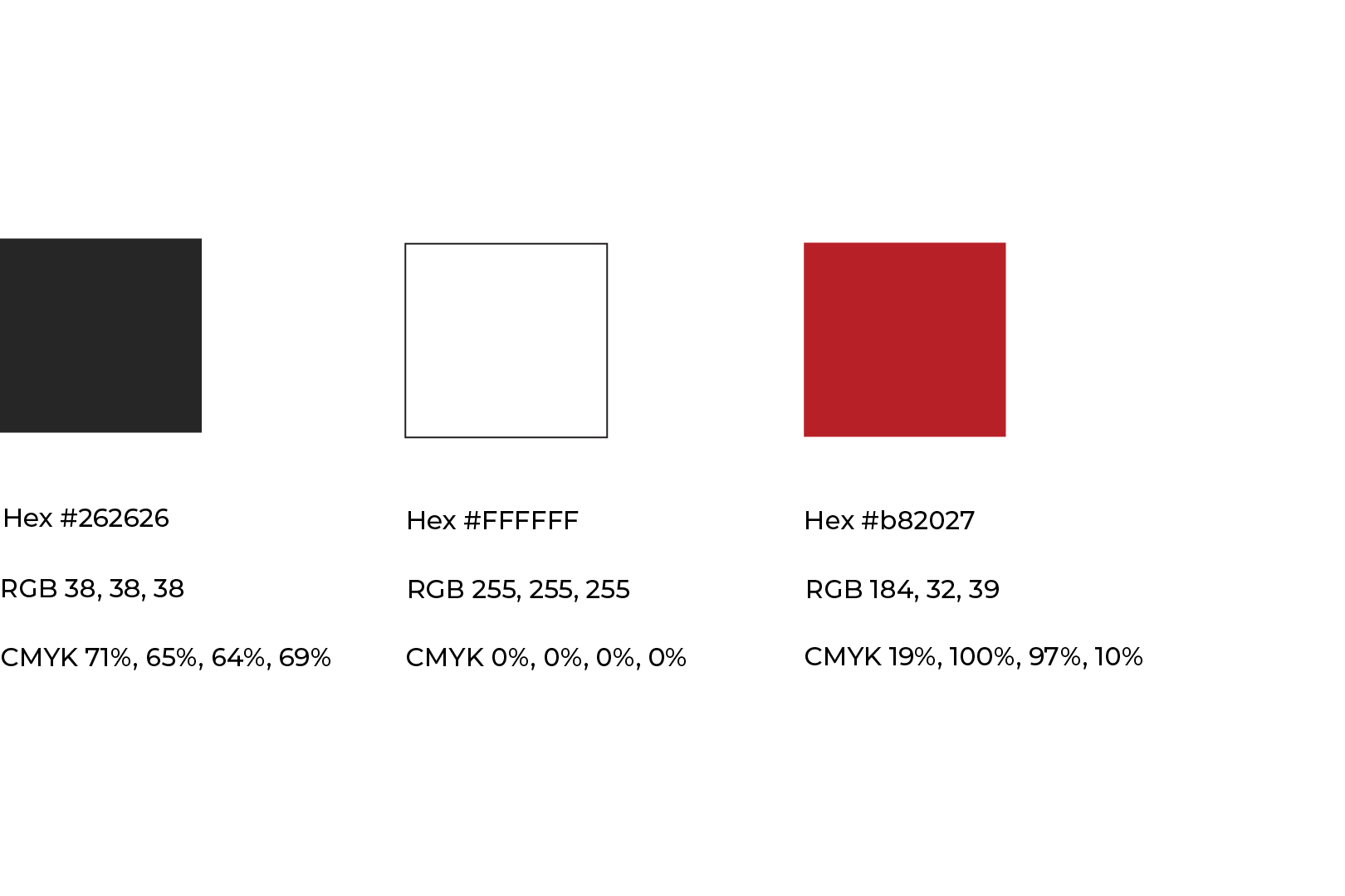
The cool, muted red is the perfect choice for this romance and crime book because red is commonly associated with crime and romance. Not only that, but the muted red still gives the boldness I was after but is not distracting from the rest of the content. The off-black gives the darkness that comes with the mafia and organized crime but is not too harsh against the red or the white. It also pairs well with the black-and-white images chosen for this project.
Typography
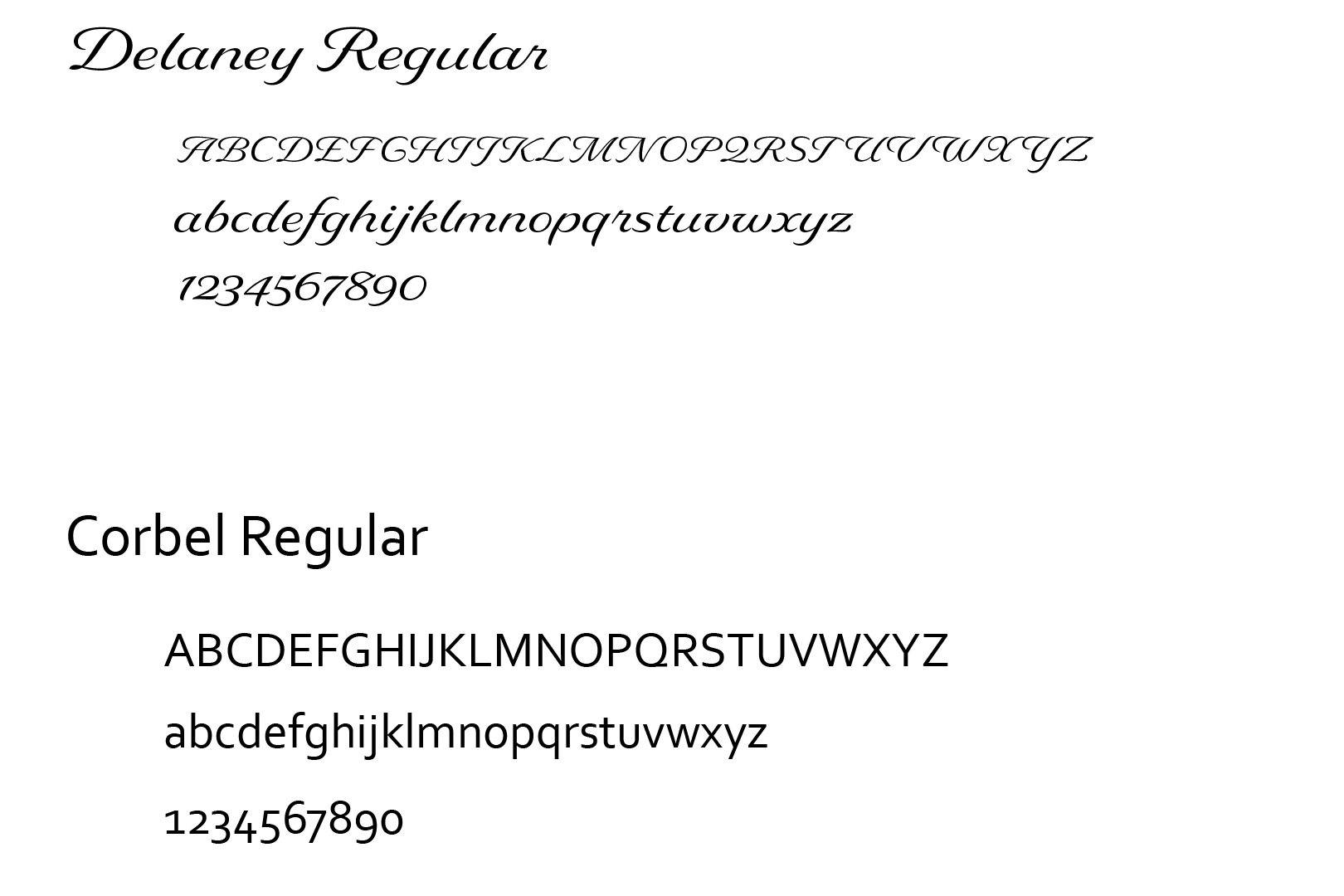
Based on my mood board and the romance theme of this book, I picked an elegant script typeface, Delaney, for the title and chapter titles. I then paired it with Corbel, a sans-serif typeface. I picked Corbel because of its simplicity. With some of the elements in this design being on the bold side, it was important that the paragraph text had simplicity. Not only are these typefaces great for this book's organized crime and romance theme, but they are also great for the setting. It shows the elegance of Italy.
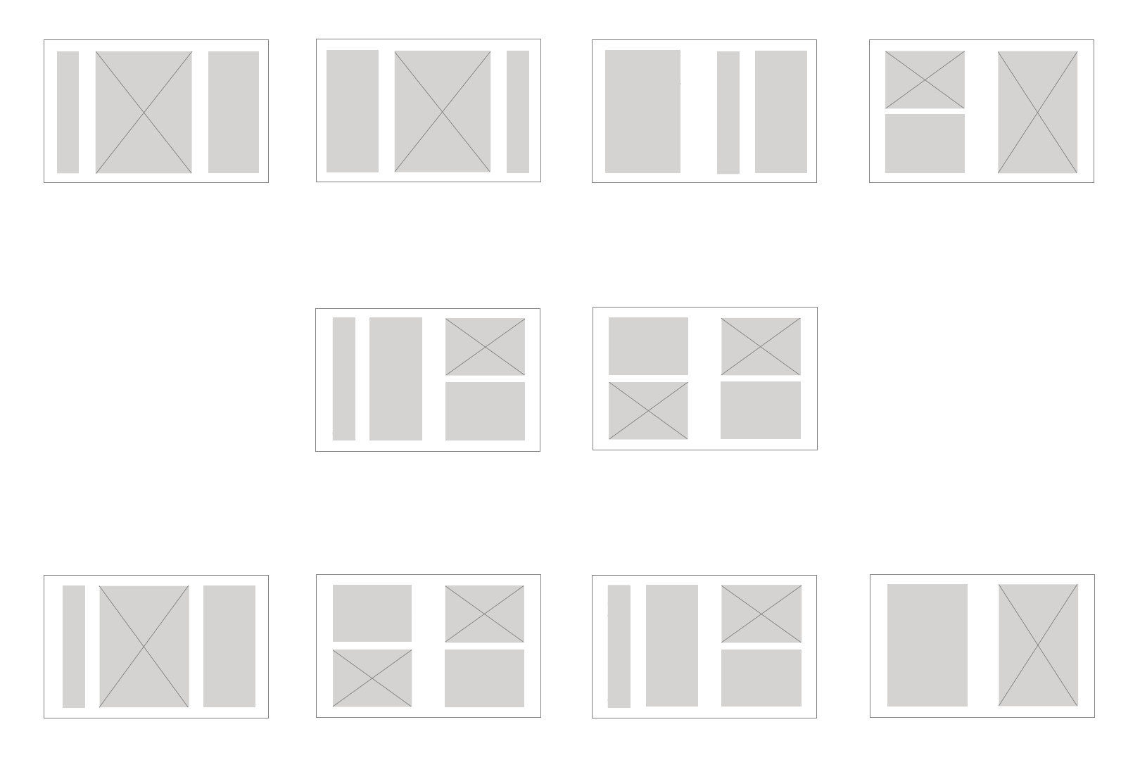
Grid Layout
This is how I originally had my grid layout set up. My goal was to make this book design bold to go along with the mafia and organized crime theme, so I already positioned where I wanted the large chapter titles in the layout and then also made the images large to go with the bold design.
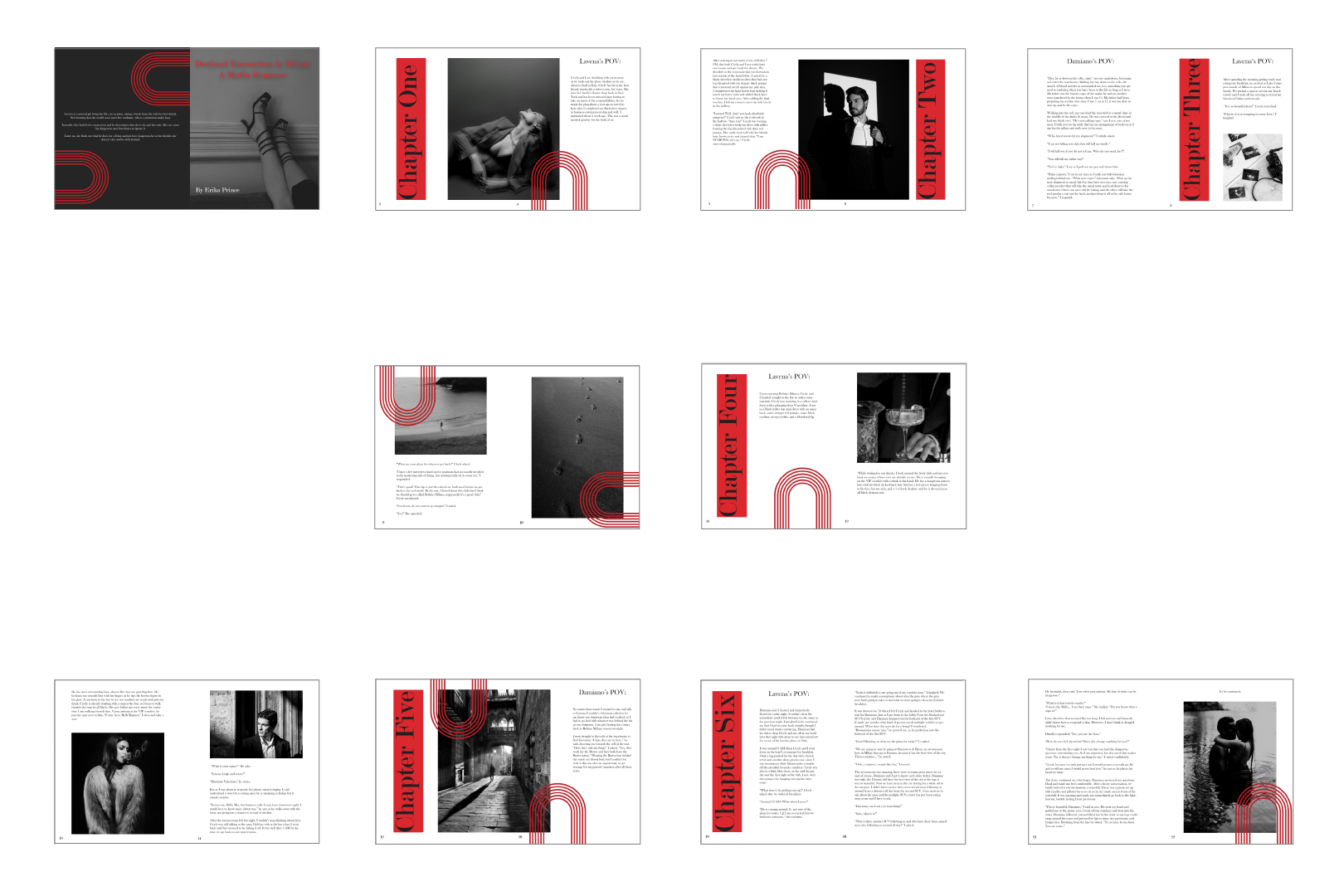
Draft
You can see how the layout resembles the original grid layout. I made small changes by moving over the images and text to accommodate where the binding will be so that the photos do not get cut off in essential areas. Again, I wanted this design to be bold and out of the box for me, so the chapter titles are large and in a red box, the images are large and go across two pages at times, and the graphic element is also large and bold, taking away the negative space. After taking a step back, I realized this iteration had too many bold elements, and some elements needed to be simplified.
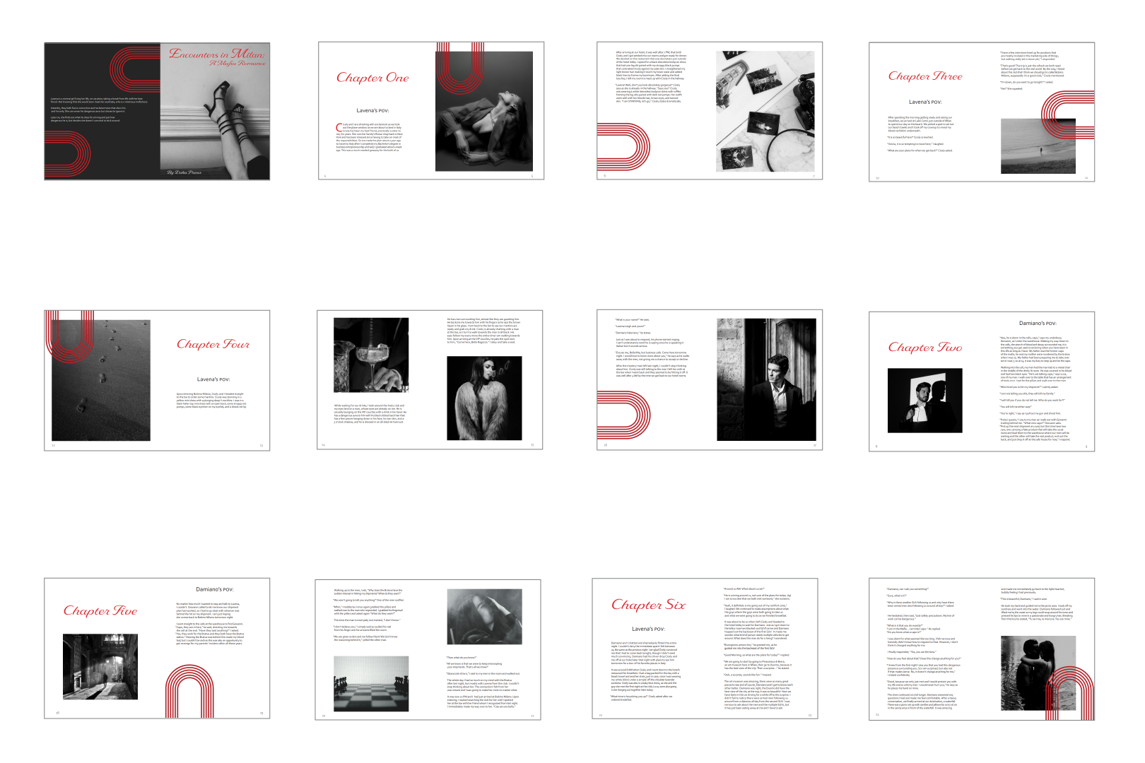
Final Design
For the final design, I redid the layout to make the chapter titles less aggressive and to ensure the images were placed on one page so the binding didn’t cut them off. I also utilized my negative space to create a better visual hierarchy. I still left some bold elements in the design, like the large, full-page images and the graphic element. I changed the typeface to a more elegant script to better match the romance part of the theme. I also lighted up the cover photo, as it was a bit too dark.
Environmental Contact
