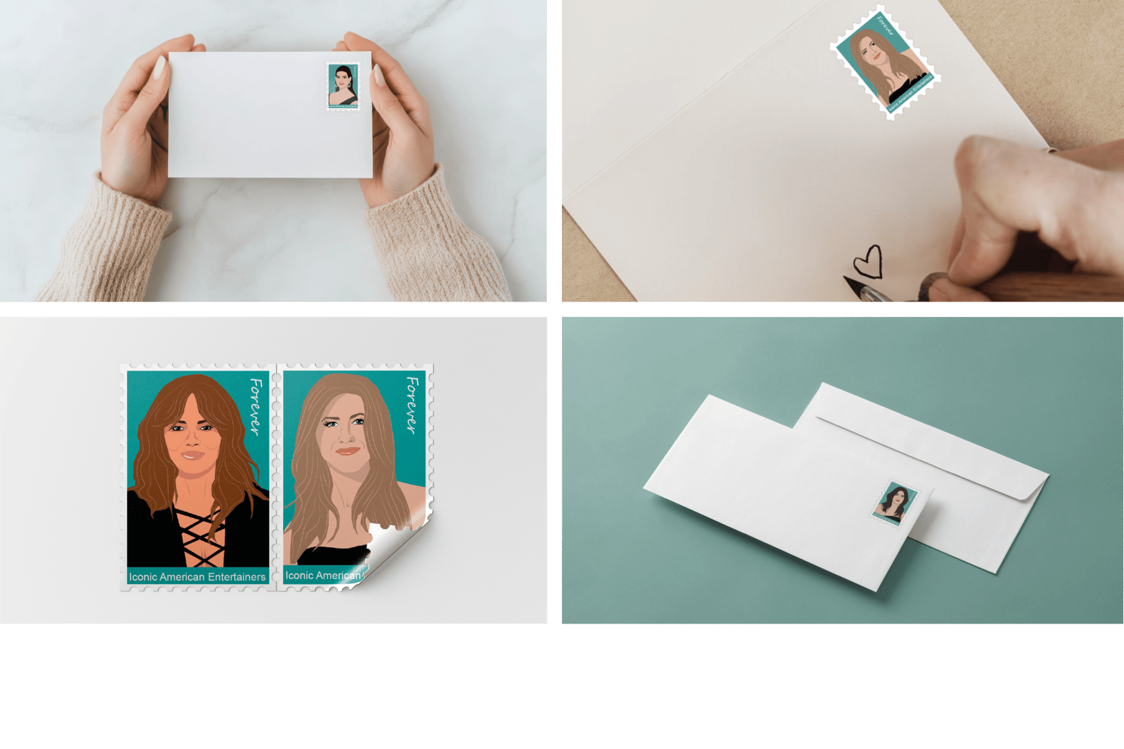
Postage Stamps
For this project, I decided to go with four actresses: Anne Hathaway, Sandra Bullock, Jennifer Aniston, and Halle Berry, since they are all well-known and play more prominent roles. These actresses have been in iconic TV shows and movies throughout their careers, and these roles have made them what they are today: ‘Iconic American Entertainers.’
Sketches
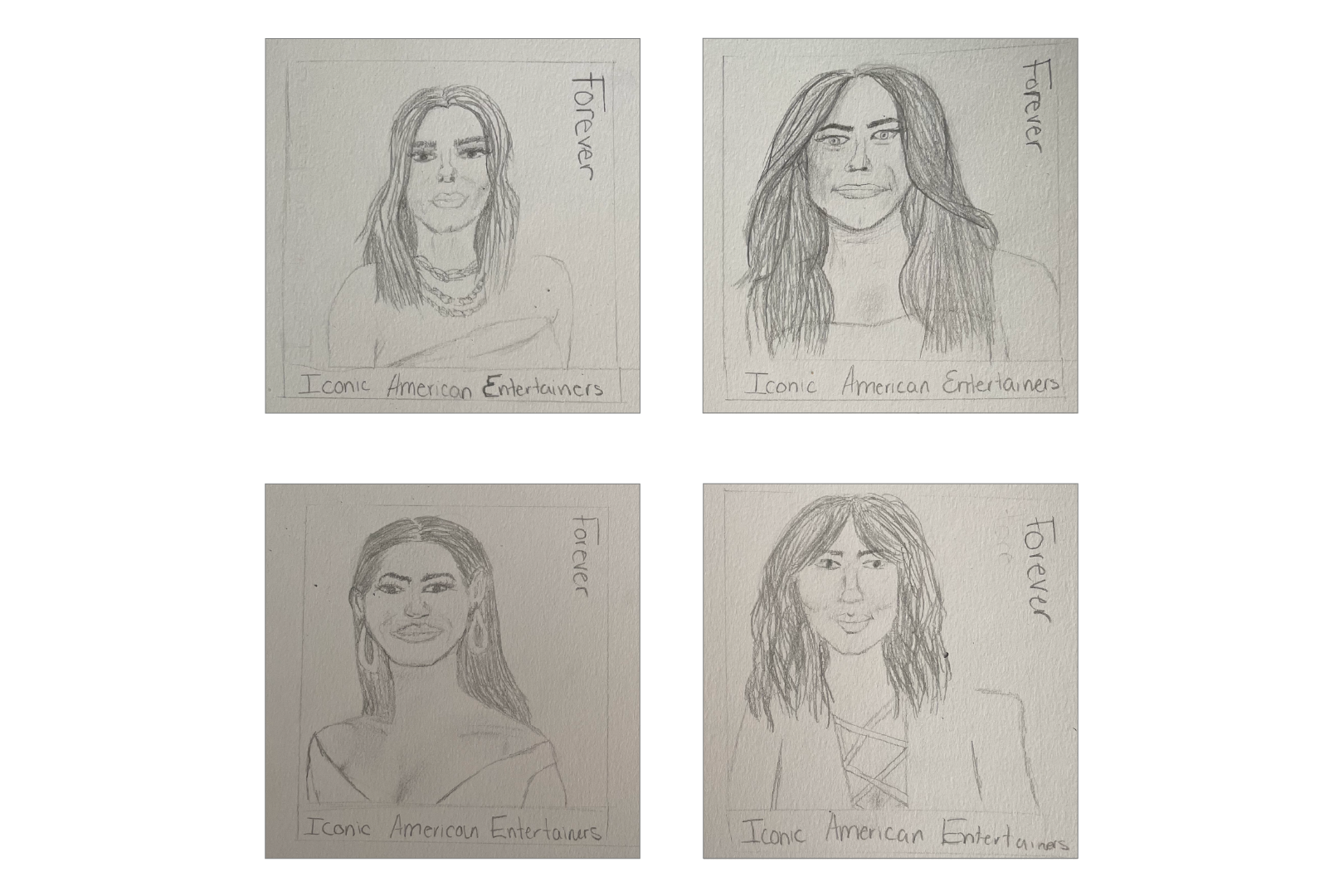
I sketched out the images I was using of all four actresses, where I wanted the typography to be placed, and the order in which the portraits would be arranged for the final design.
Color Palette
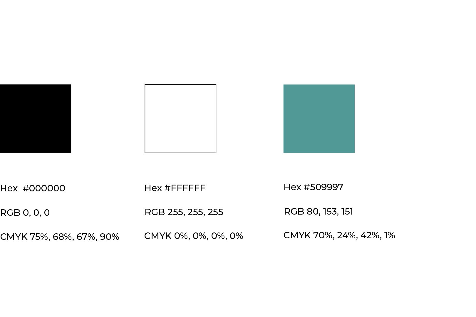
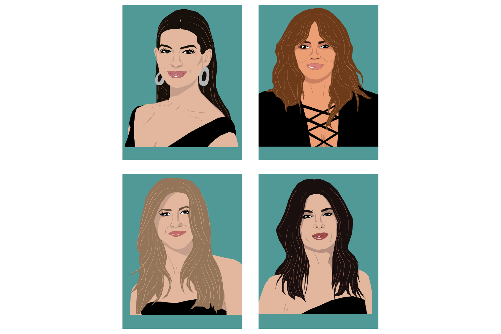
The slightly muted turquoise color complements all four actresses' skin and hair tones well without distracting from the portraits themselves. Turquoise is commonly associated with success and good fortune, which all four actresses have achieved. The white is for the typography, and the black is for their outfits, which will all be black so that all four portraits are cohesive.
Typography
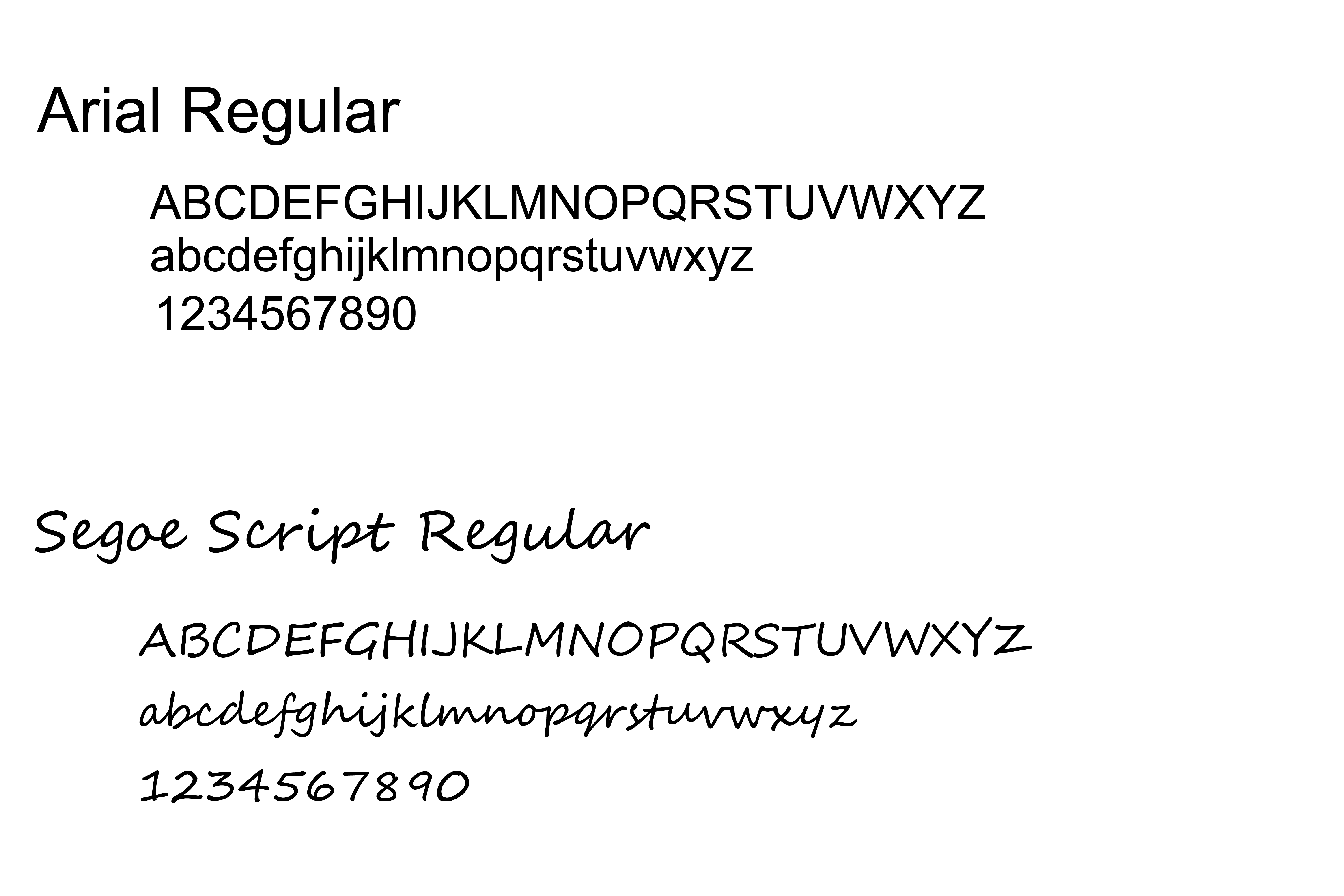
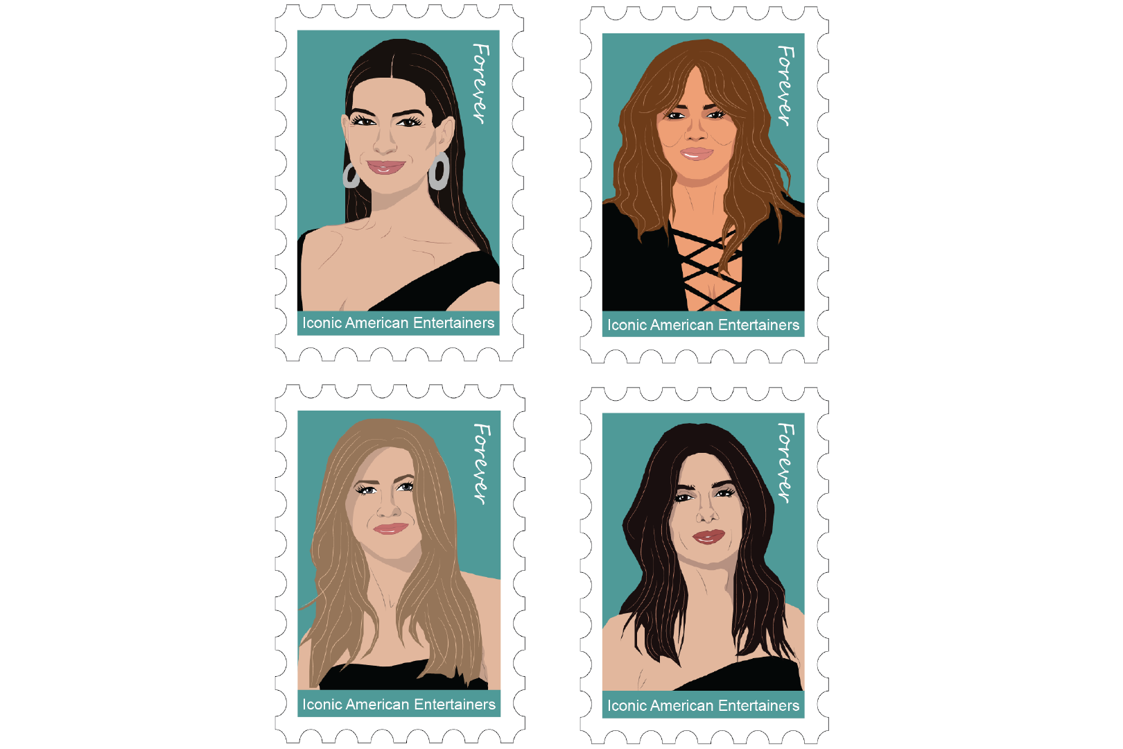
Given the small size of postage stamps, I chose a simple typeface for the main text, ‘Iconic American Entertainers’ being Arial, a simple, easy-to-read, sans-serif typeface. I paired this with Segoe Script to add a more decorative aspect to the typography for the text ‘Forever.’
Drafts
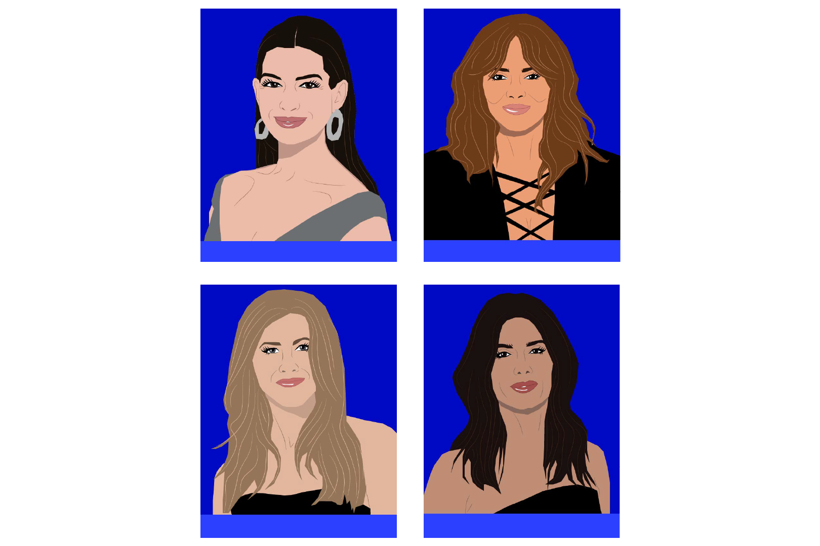
For the first iteration, I used bright, dark blue for the background, which was too distracting and took away from the portraits themselves. The portraits had inconsistencies throughout, including their hair, sharp edges versus rounded, shadows only being under the chin, and different-colored outfits.
Final Portraits
For the final portraits, I addressed all the inconsistencies. I added shadows to their faces so that shadows are throughout the portraits, added more depth to their faces, added highlights to their hair, and made all their outfits black. Another change I made was having all the caucasian women have the same skin color to make the portraits more stylized.
Postage Stamps
After finalizing the portraits, I created the postage stamps. As you can see, I stuck with the original layout I had planned in my sketches. In the top right corner, the decorative ‘Forever’ adds a visually appealing typography element but still allows the portraits to be the main focal point.
Environmental Contact
