M.A.C. Ads
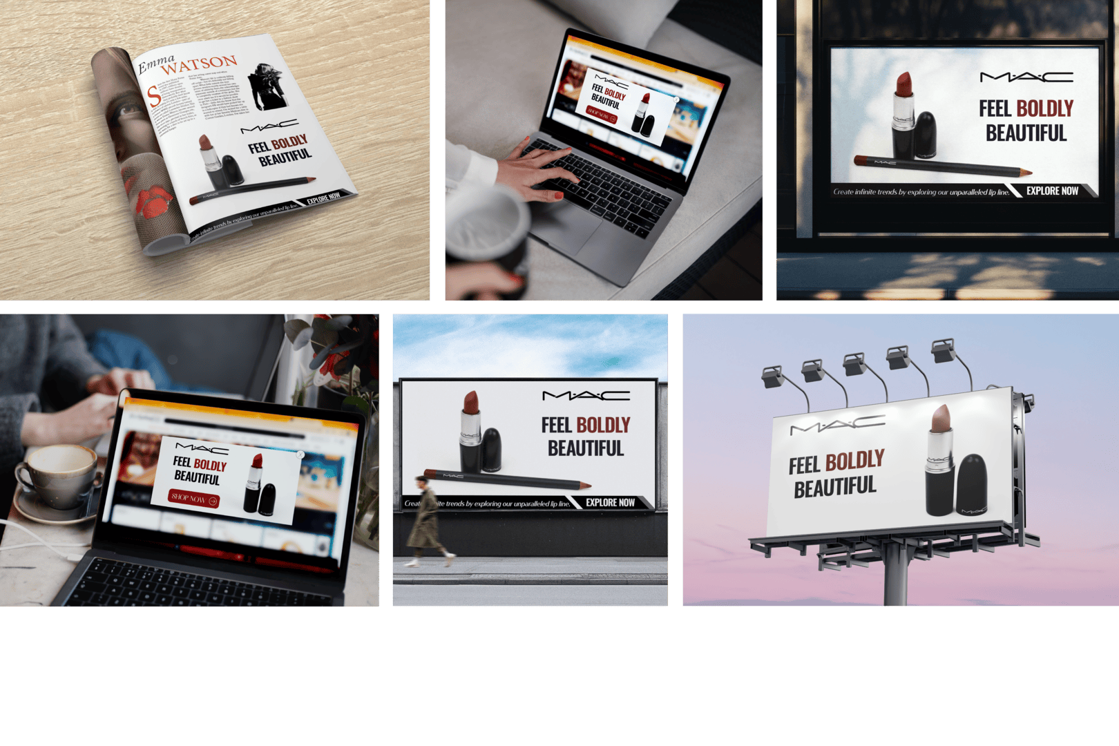
I photographed and designed ads for M.A.C., a makeup company, specifically their lipstick and lip liner products. For this design, I wanted the ads to align with M.A.C.’s branding, which is more straightforward and modern. To achieve this, the main focal point is the product, and all the other elements are simple and clean.
Sketches
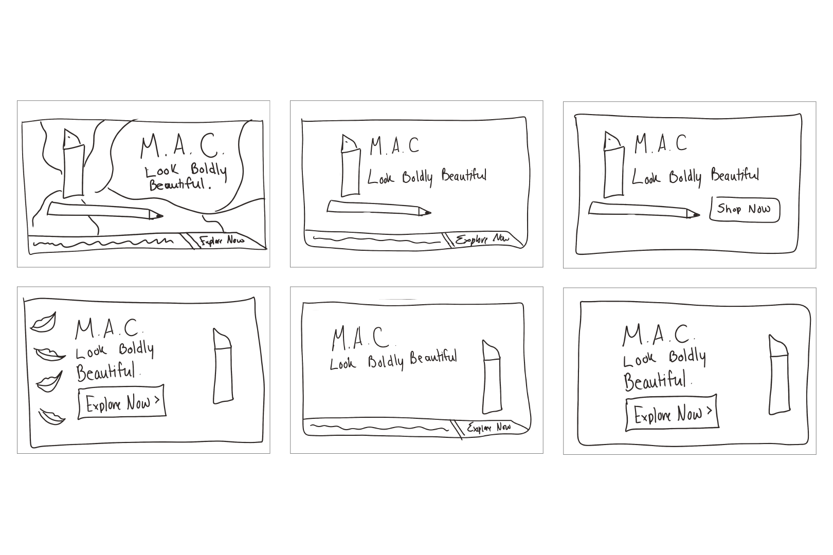
My original plan for this project was to have swatches of the lipstick and lip liner in the photos and then just white background photos. Then, on the white background images, I would have lip prints in the lipstick color. This would allow viewers to see the color of the lipstick and lip liner.
Color Palette
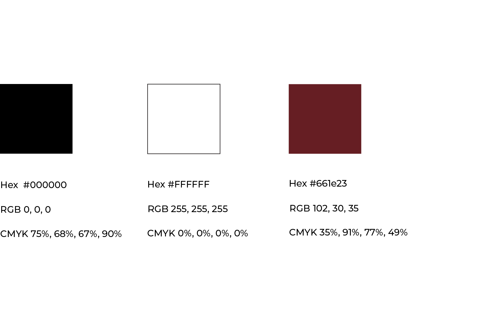
To go along with M.A.C’s brand identity and maintain brand awareness, it was crucial that I used their brand colors. That is why black and white are the main colors in this project. I did add an accent color, a neutral, cool-toned red, to show the color of the actual product in the ads.
Typography
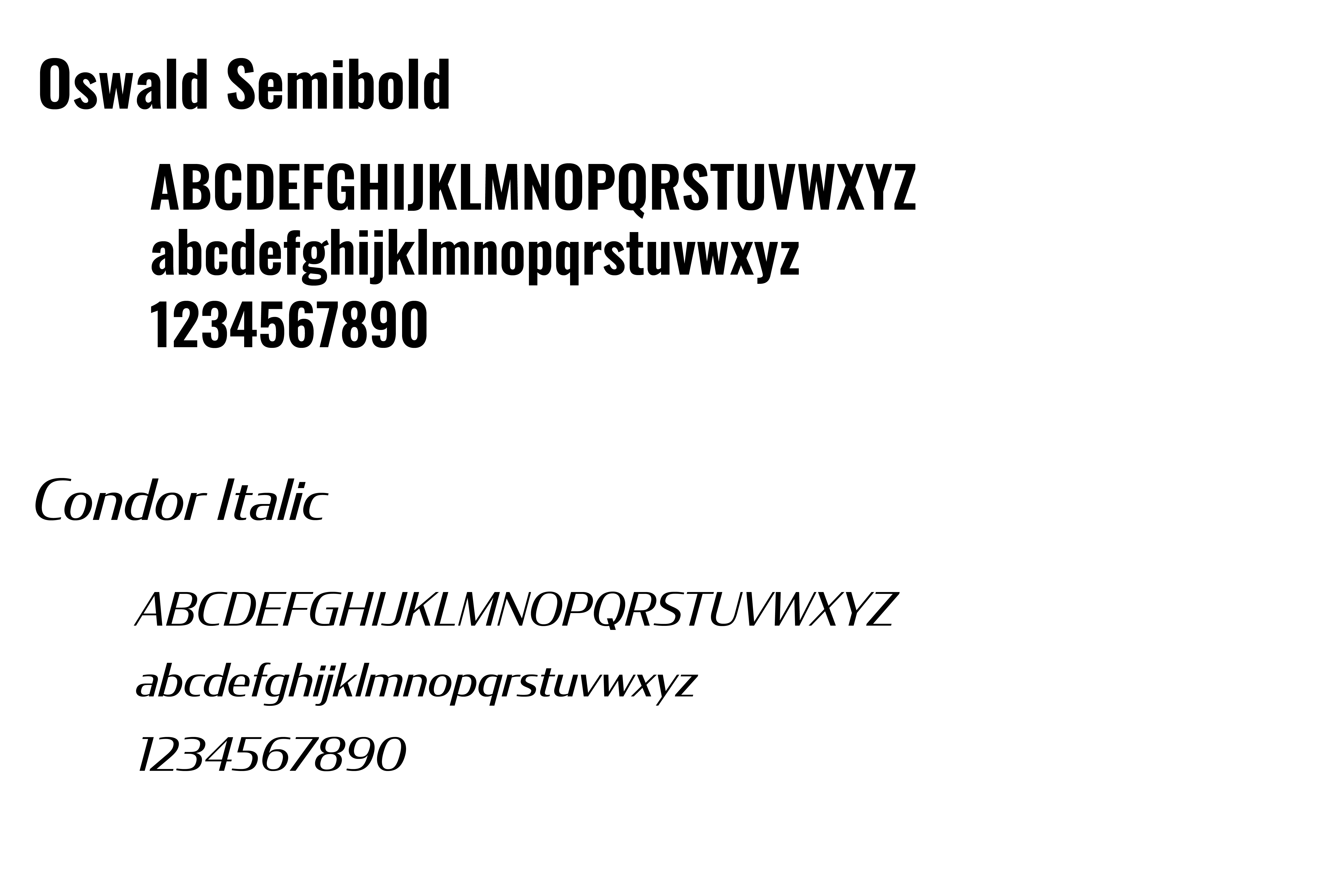
While using the phrase “Feel Boldly Beautiful” in my ads, I thought it would make a statement to use a bold and blocky typeface to go along with it. I chose Oswald Semibold, because it is bold and achieves the look I wanted. Not only that, but it is also easy to read up close and from a distance. Condor pairs well with Oswald because it creates an excellent hierarchy between the text, making it a great option for the call to action.
Unedited Images
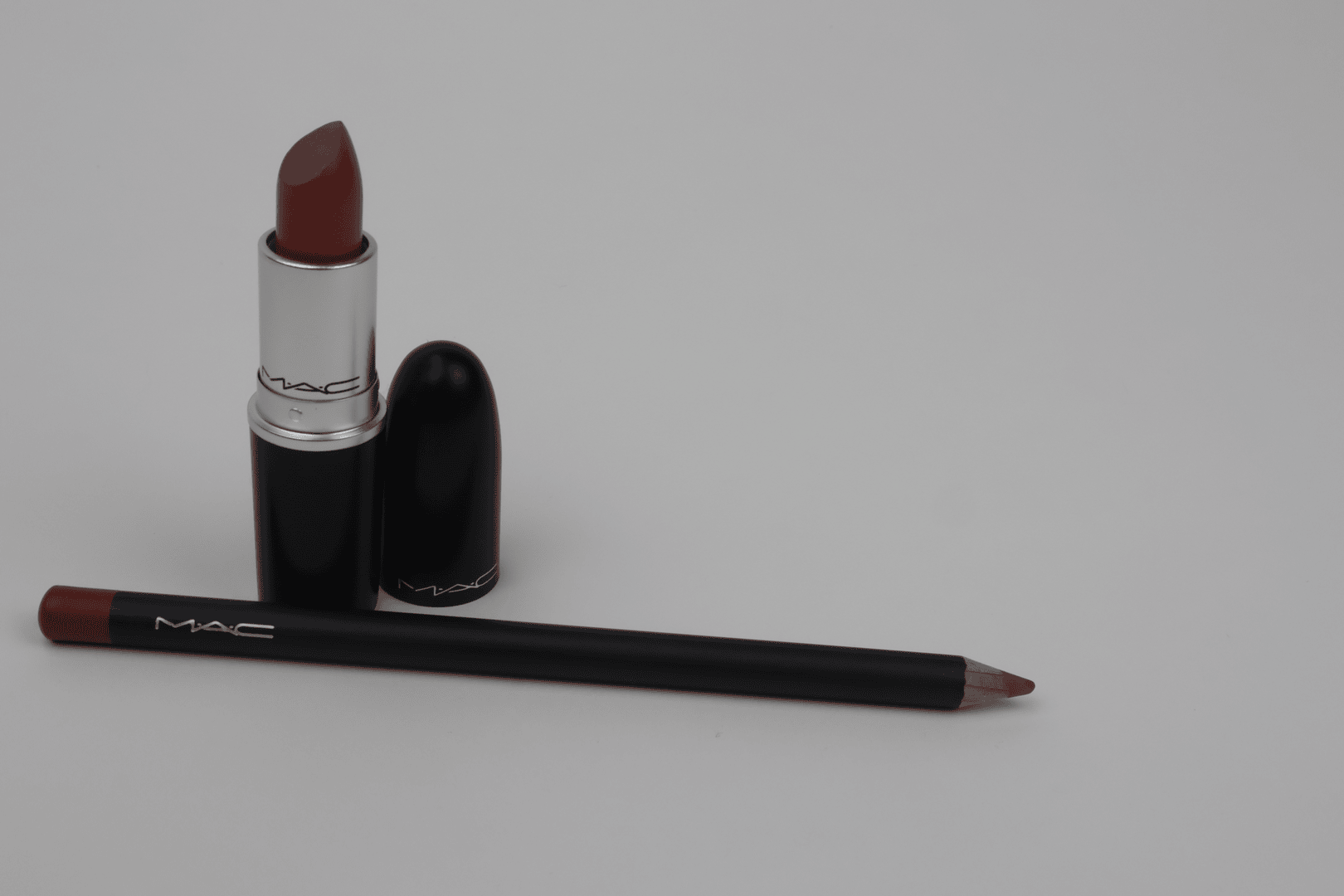
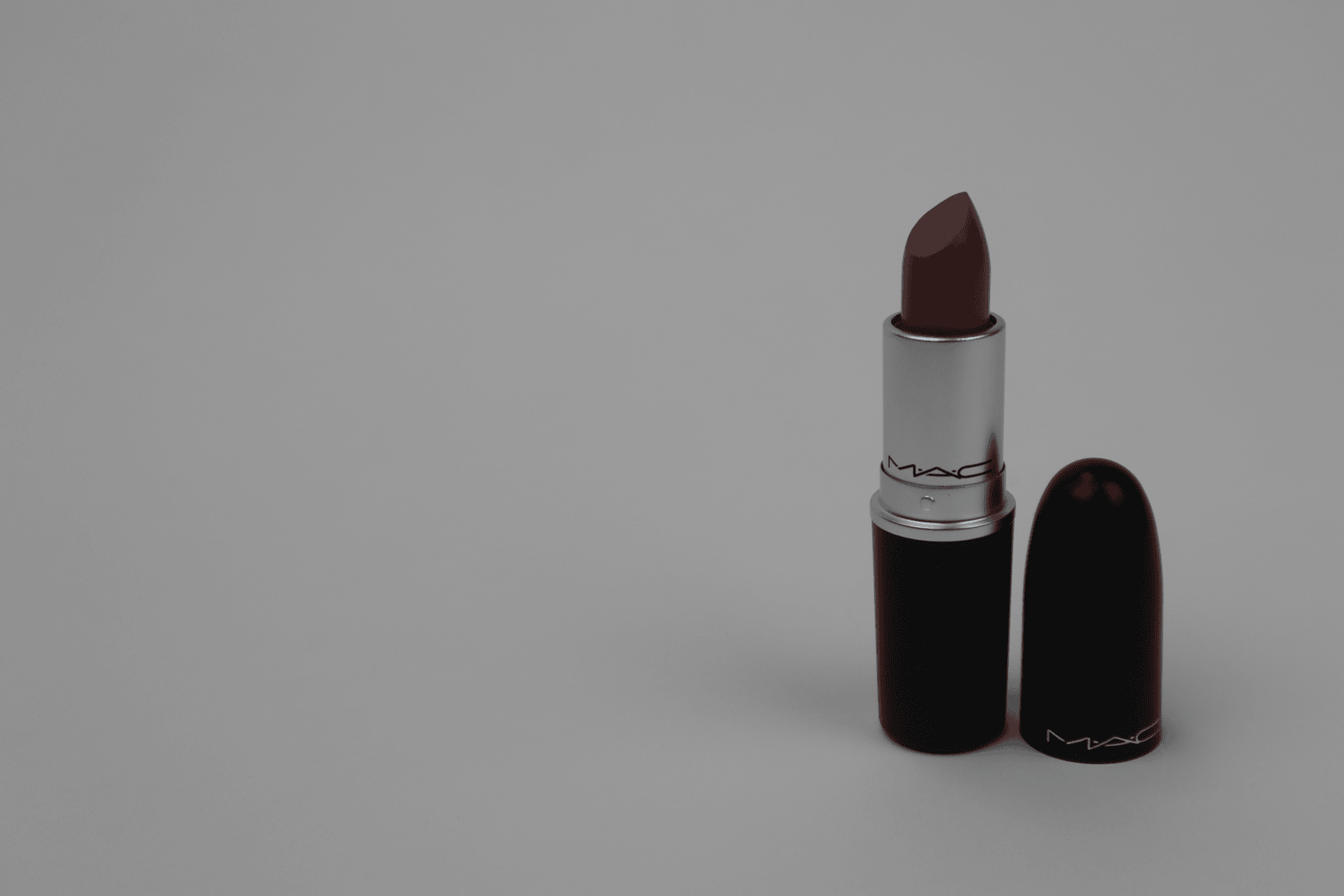
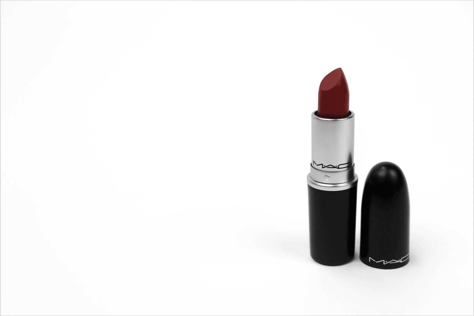
The images turned out to be how I wanted them to be regarding how the products are positioned. The unedited photos were way too dark and needed to be lightened up to display the products correctly and to achieve the modern, clean look that M.A.C. carries throughout its brand.
Edited Images
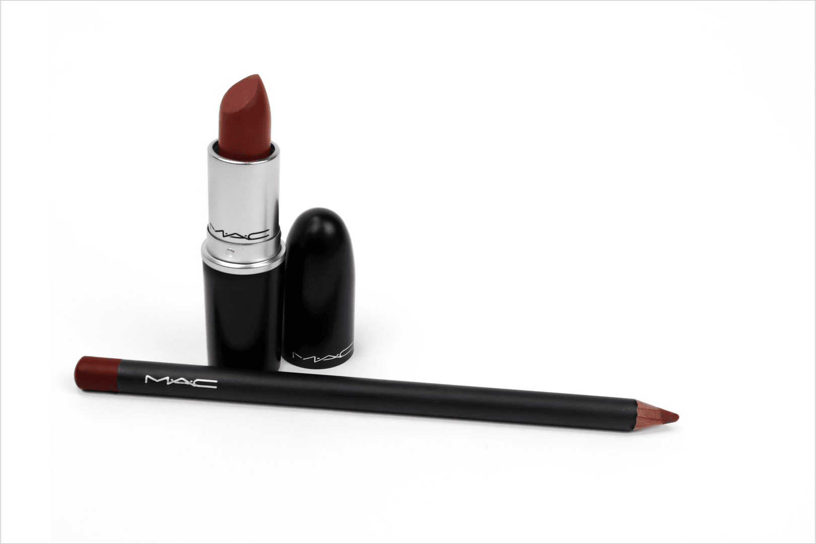
Since the unedited photos were too dark, I prioritized making these images brighter and the backgrounds a clean white. So I made the images brighter, enhanced the white background, and masked the highlights on the black packaging to make them brighter and to see the natural gradient in the photos. Enhancing the natural gradient on the products in the photos gave them a professional look and made the photos more visually appealing. This achieves the modern, clean look that I was going for, and the now white backgrounds have created a great space to add the visual elements needed to create the ads.
Finals
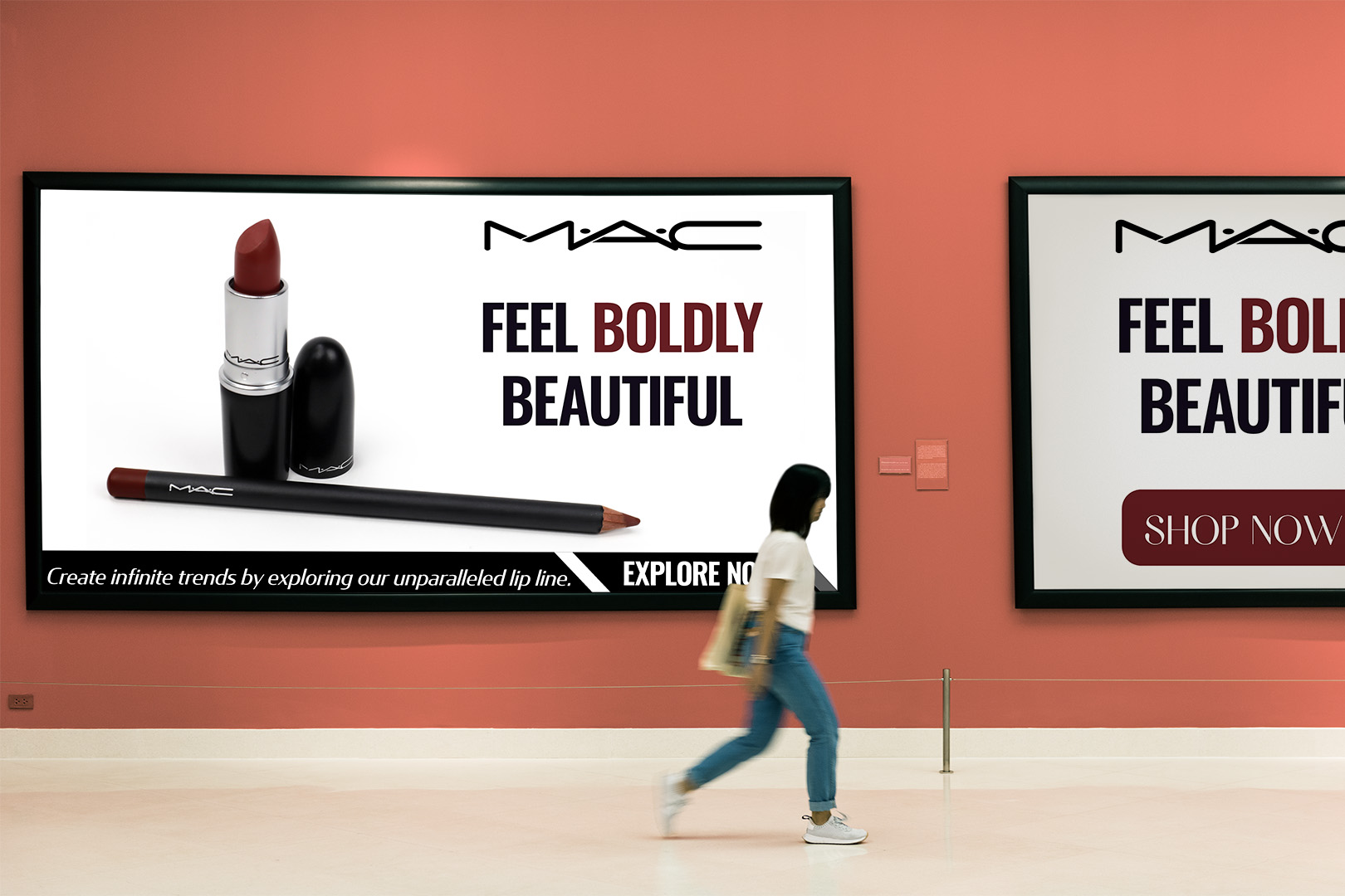
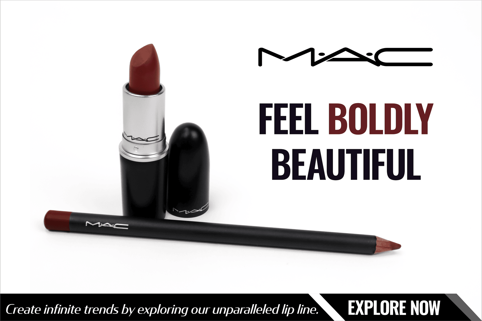
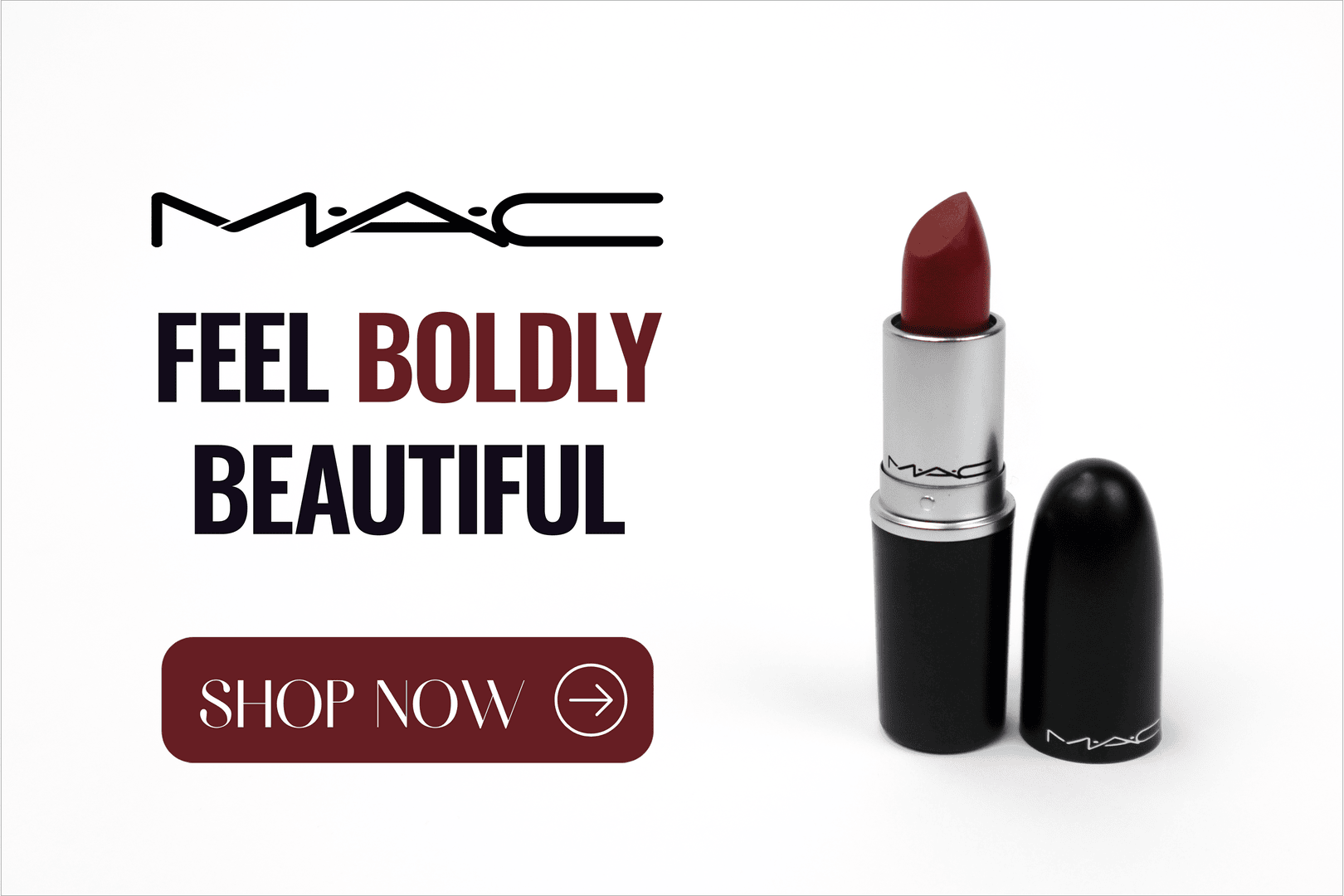
For the final designs, I used the negative space to separate the elements and properly create a visual hierarchy. This also aligns with M.A.C.'s modern and clean brand identity, as the only real main focus is the product and the tagline. I made the word “Boldly” the same color as the lipstick to not only make it stand out but also to show the viewers the lipstick color. All the graphic elements and typography are lined up with the top of the lipstick and the bottom in the photo, so the margin is the same all the way around and looks cohesive.
Environmental Contact
